Responsive Web Design
A mobile responsive web site automatically detects then changes its layout and appearance based on size of the screen it is being viewed on. So regardless if it is a large wide-screen monitor or a small handheld mobile device, your web site will always look and function its absolute best. Since 2015, Google has been penalizing websites that are not responsive and today more Google searches are done using a mobile device than a desktop. It is clear that having a mobile-friendly website has never been so important and critical to the success of any business.
At The Rusty Pixel we know that mobile Internet browsing is the future of the web which is why we specialize in responsive web design. Give your website visitors the best possible viewing experience regardless if they are on a desktop, laptop, tablet or smartphone with a mobile-friendly website.
Responsive Web Examples
Scroll down to check out some examples of our previous mobile-friendly responsive web design work.
Melbourne Defense Law

- Features
- 100% Custom Design
- Content Management System (CMS)
- Mobile Responsive
- Email Contact Form
- Facts
- Location: Mebourne, Florida
- Client Since: 2012
- Specializing in criminal defense law
- Code Languages: HTML, CSS, PHP, jQuery
- www.MelbourneDefenseLaw.com
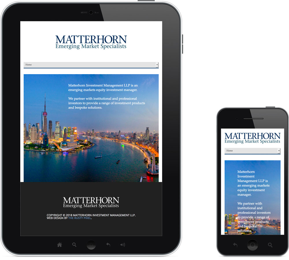
Matterhorn Investments
- Features
- Semi-Custom Design
- Content Management System (CMS)
- Mobile Responsive
- Facts
- Location: London & Hong Kong
- Client Since: 2015
- Emerging markets equity investment manager
- Code Languages: HTML5, CSS3, PHP, jQuery
- www.MatterhornInvestment.com
Ready to Get Started?
Citizens for Florida’s Waterways

- Features
- Facts
- Location: Cape Canaveral, FL
- Client Since: 2015
- Promotes the need for responsible use of Florida’s waterways
- Code Languages: HTML, CSS, PHP, jQuery
- www.cffw.org
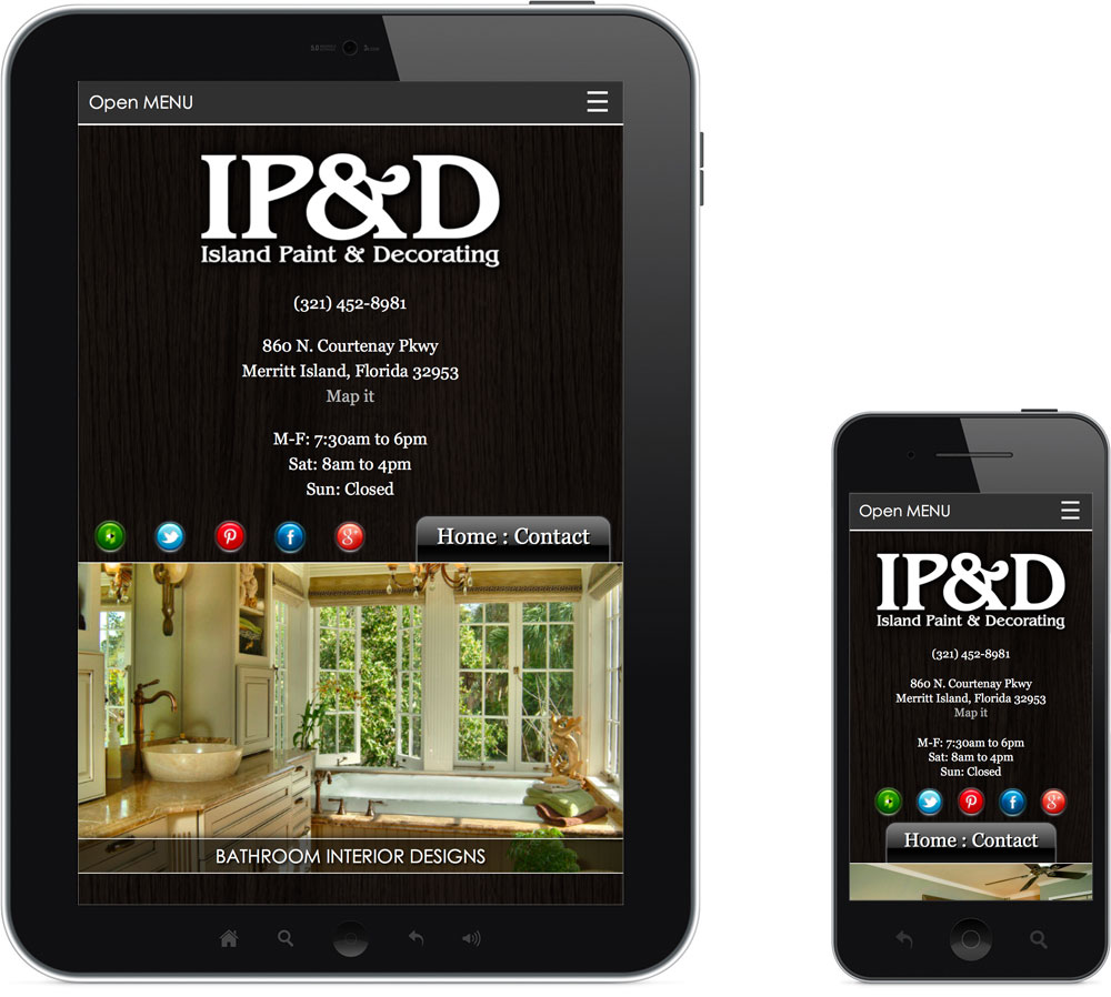
Island Paint & Decorating
- Features
- 100% Custom Design
- Mobile Responsive
- Animated Image Carousel
- Email Contact Form
- Facts
- Location: Merritt Island, FL
- Client Since: 2012
- Specializing in paint supplies, decorating and home design
- Code Languages: HTML5, CSS3, PHP, jQuery
- www.IslandPaintAndDecorating.com
About Our Mobile-Friendly Websites
When a user visits your website it is important that they have the best possible experience regardless of the device or screen-size they are using. Today that device can be anything from the tiniest smartphone to the widest desktop monitor and everything in-between. To ensure a quality experience across all those different devices it is important that your new website be responsive and at The Rusty Pixel we specialize in mobile-friendly web design.
The techie term for a mobile-friendly website is “responsive” because your web site automatically detects the users screen resolution and “responds” by loading the optimal design for their particular device and screen size. So essentially you will have one website with multiple versions of it; Even though the design and layout will change from version to version the look and feel will remain consistent preserving your brand and style. This method is much more efficient than having separate domain names and separate sets of content for both the mobile and regular versions of your website.
Since Apple released its 1st generation iPhone in 2007, mobile Internet browsing on all types of mobile devices has exploded. As of January 2016 over 52% of global and over 75% of U.S. Internet users accessed the Internet via a mobile device. In 2015 Google confirmed that more searches were done on mobile devices than on desktops. More importantly and also in 2015, Google began penalizing the search engine rankings of any website that were not mobile responsive (if the search was done on a mobile device); it is only a matter of time until all major searches follow Google’s lead. For these reasons and more having a responsive web design has never been more critical to a businesses success. The bottom-line is that without a mobile-friendly website design you will lose out on search engine traffic.
At The Rusty Pixel, our mobile-friendly websites include optimization for all major types of devices used to surf the Internet today including desktops, laptops, tablets and smartphones. Each type of device and screen size presents different challenges and requirements which need to be addressed to ensure your website is truly mobile-friendly. For example; On a desktop you use a mouse to interact with a website but on a touch device such as a smart phone you use your finger. As a result certain website elements need to be adjusted so the user can interact with them on their touch-only device as easily as they could on a desktop.
One of these elements that need to be adjusted are drop-down menus which traditionally work by hovering a mouse to activate the drop-down functionality. Of course, “hovering a mouse” is not something you cannot do on a touch-only device making it difficult, if not impossible, for users on mobile devices to access that information. As you can imagine having large portions of your website inaccessible to all your mobile visitors is not good. A mobile responsive design solves this problem by detecting if the user is or is not using a touch device as the website is loading; It then automatically responds with either hover or touch activated drop-down menus accordingly, making it accessible on all devices.
The smaller the device the greater the premium each and every of pixel of screen space demands. Because of this we streamline your main navigation menu by making it take up as little real estate as possible and only expanding when needed by a single click of a finger. At The Rusty Pixel we do this on all our mobile-friendly websites by utilizing touch activated drop-down or accordion style navigation menus on touch-only devices and standard navigation otherwise.
We also double-check that the font size is large enough to be legible at all screen sizes, images are optimized for slower mobile connection speeds and that links/buttons are spaced far enough apart to be easily pressed using a finger. Because your website can be viewed on a cellphone we make all phone numbers “click to call” interactive so visitors can call with just a press of a button. Being mobile-friendly also negates the need of tediously pinching in and out to view and read content when browsing a website on a mobile device. Finally, to ensure that your web site is indeed mobile-friendly we will have it analyzed and verified by Google as mobile responsive.
A responsive web site can be added to any of our web design packages. If you have an existing website that is not responsive we can add the necessary mobile-friendly features and code to it. Even if you think you website is mobile responsive Google robots may not view it that way so have our mobile-responsive web design experts review your website for free of charge.
Despite the fact that mobile Internet browsing is still just in its infancy it is clear where the technology is going; Devices will only continue to become smaller and more prevalent, while at the same time Internet connections speeds will only continue to increase and become more reliable. For these reasons and more, mobile Internet browsing is the future of the web. At The Rusty Pixel we can create you a streamlined and Google verified mobile-friendly responsive website design that is both beautiful and super easy-to-use.
Below you can see a feature and functionality list of what is included with our mobile-friendly responsive web design. If you have any questions just contact us or request a mobile responsive web design.
Automatically Detects Screen-Size and Responds for All Devices
- Desktops: From standard smaller screens to newer wide-screen monitors
- Laptops: All sizes, makes and models
- Tablets: iPads, Androids, Nexus, etc
- Smart-Phones: iPhones, Android, Gallaxy, etc
Responsive Website Features
- Automatically detects type of device and screen-size then responds with the optimal layout and functionality
- Ensures best possible viewing experience regardless of device
- Google verified as mobile-friendly
- No penalization on Google searches for not being responsive
- One website, domain and set of content with multiple versions of it
- Consistent design, look and feel on all different versions
- Touch-friendly browsing
- Streamlined drop-down or accordion style navigation menus
- No pinching in and out to view and read content
- Touch-activated drop-down menus
- Readable text size across all devices
- Interactive “click to call” phone numbers
Responsive Web Design Melbourne FL
Mobile-Friendly Responsive Web Design Melbourne FL Firm
We specialize in mobile-friendly responsive web design Melbourne FL. Perfect for smartphones, tablets and all mobile devices in Brevard County FL web design